

UX DESIGN - P01
The Practice of Democracy
-
A bold, fast-moving project built under pressure.
We were tasked with creating a digital companion to a public exhibition on a tight timeline, limited budget, and with shifting feedback from a large client team. The goal? Make civic education feel immersive and inspiring for hundreds of in-person attendees and leave a lasting impression online.
-
Served as UX Consultant, Designer, illustrator and production designer.
Tools & Skills: Digital Illustration (Adobe Illustrator), wireframing & UX/UI (Sketch, Figma), animation (Adobe AfterEffects), Web Development (Wordpress, CSS)
Context
We were asked to design and deliver a website for The Practice of Democracy, a civic engagement exhibit hosted in tandem with a physical installation. The catch? The launch date was tied to the exhibit's fast approaching opening, and couldn’t be moved.
The client team was passionate but spread thin, and dev support was out of budget. We had to adapt fast, get feedback often, and ship something that worked beautifully for both visitors and the team that would maintain it.
Early Vision
Main Experience
Our early concepts centered on making the site feel like an interactive map tour. I sketched out the idea of a landmark-based navigation system, where users could click on icons and preview each location via pop-ups that led to deeper detail pages.
I also pitched the idea of embedding 360-degree views of each site, if we could get access to panoramic assets or Google integrations.

^Map journey with location details.

^360 view concept for each highlighted location
User Engagement
Another key feature I explored was user engagement via social media. The client hoped to gather and showcase community voices, so I proposed a campaign encouraging attendees and community members to share stories about civic spaces using a dedicated hashtag. These posts would then populate a live feed on the website, forming a user-generated layer to the experience.
For the location detail pages, we proposed small interactive elements to enhance engagement and accessibility, such as a progress bar to guide users through the content and audio narrations to bring the stories to life for all audiences.
At this point, we were designing toward an ideal.

^Location Details

^Community submissions feed
Strategic Pivot
With the launch date accelerated and budget still tight, we knew we had to prioritize differently. Me and the team reassessed the scope and adjusted the entire strategy.
Instead of a feature-heavy build, we focused on delivering an experience that would be usable, engaging, and visually striking, within the time and tools we had.
Visual Exploration
We removed high-maintenance ideas like the 360 view and social media aggregator, which would’ve required moderation and reliable third-party plugins that weren’t feasible. We replaced these with custom visual storytelling elements and interactions we could fully control, including animations, interactive graphics, and a vibrant, branded map that kept users anchored in the experience.

Final Product
Landing Page
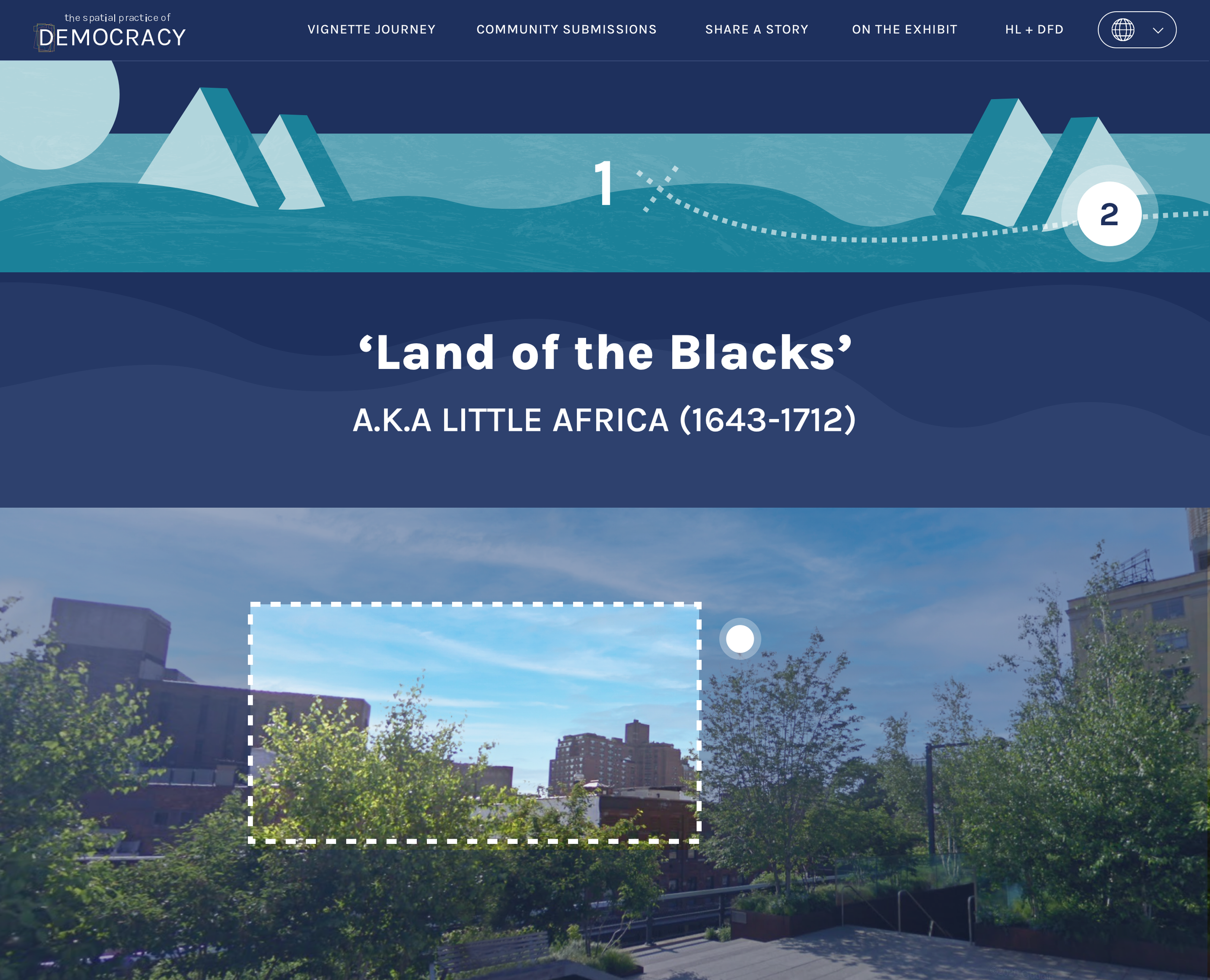
Map Journey
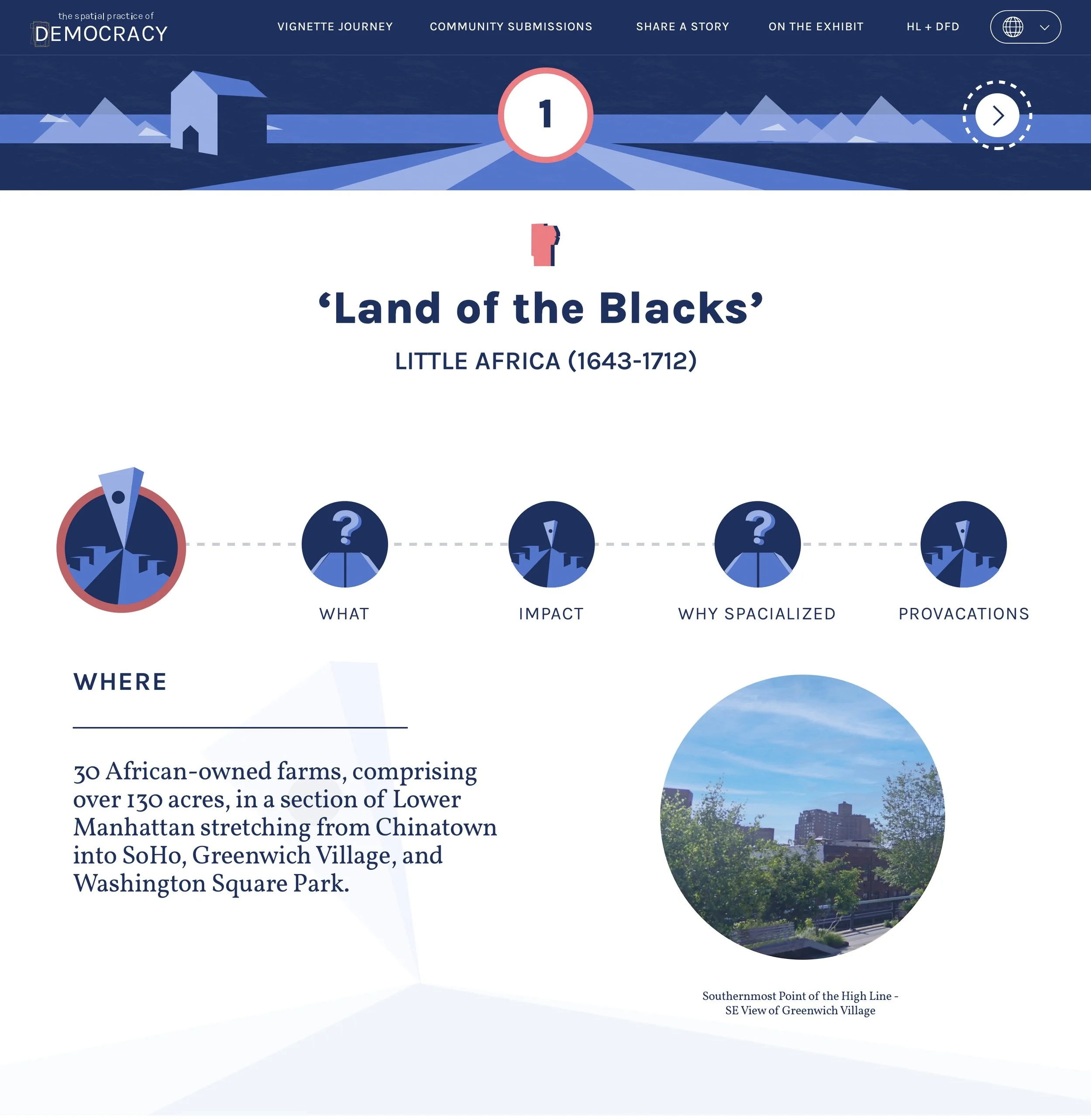
Location Details
Despite the rapid shift, we delivered a high-quality site that helped hundreds of attendees dive deeper into the stories featured in the exhibition. The site extended the reach of the physical installation, becoming an educational resource that continues to offer a lasting impact.
